Evently
An online event booking app
Overview
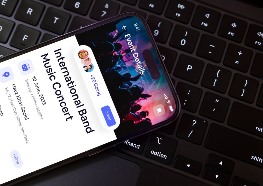
Evently is an innovative online event booking app that aims to streamline the process of discovering and booking events. With a user-centered design approach, Evently offers a seamless and intuitive experience for event organizers and attendees alike. The app simplifies event management, allowing organizers to create and promote events effortlessly. Users can easily browse through a wide range of events, purchase tickets, and stay updated with event details. With its user-friendly interface and powerful features, Evently revolutionizes the way people find and attend events, making event planning a breeze for organizers and providing unforgettable experiences for attendees.
Problem Statement
Event booking apps currently on the market fall short in delivering a comprehensive solution, resulting in user frustration and overwhelm. These apps lack crucial features necessary for smooth event management and an enjoyable experience for attendees, thus impeding the process of event discovery and booking. Evently strives to address this gap by introducing a user-friendly platform embedded with innovative features that cater to the needs of both event organizers and attendees, ensuring a seamless and satisfying experience for all parties involved.
My contribution
As a product designer, my role in the development of Evently was instrumental in creating a user-centered platform. Collaborating closely with a cross-functional team, I contributed to the ideation and design phases, ensuring a seamless user experience. Through iterative wireframing, prototyping, and user testing, I played a key role in refining the app’s interface and functionality. By actively engaging with stakeholders and incorporating feedback, I fostered a collaborative environment, resulting in a well-rounded product that met the needs of both event organizers and attendees.
Building Evently from Scratch
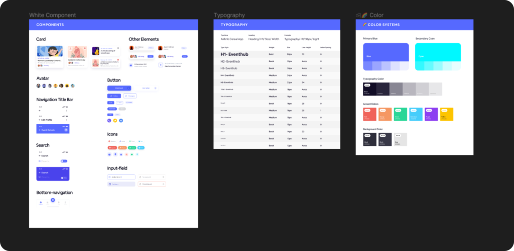
Building Evently from the ground up was an exhilarating journey that involved several stages. We started by developing a Minimum Viable Product (MVP) that showcased the core features and functionality. Through continuous feedback from users and stakeholders, we iterated on the design, enhancing usability and addressing pain points. We conducted user testing sessions to gather insights and refine the app’s interface, ensuring a smooth and intuitive experience for both event organizers and attendees. After multiple iterations and rigorous testing, we successfully transformed Evently into a robust and user-friendly app, ready to revolutionize the event booking industry.
Launching of Evently
With great anticipation, we launched the Minimum Viable Product (MVP) of Evently, eager to gather real-world feedback and validate our assumptions. During this phase, we encountered several problems that required our immediate attention. Users faced challenges with the onboarding process, as the initial setup proved confusing and time-consuming.
Additionally, some users reported difficulties in navigating the app’s interface, resulting in a less-than-optimal user experience. Through comprehensive user testing and feedback analysis, we identified these pain points and prioritized addressing them in subsequent iterations. This phase was crucial in understanding the areas that needed improvement, allowing us to refine the app and deliver a more polished and intuitive experience to our users.
Testing and Iterating
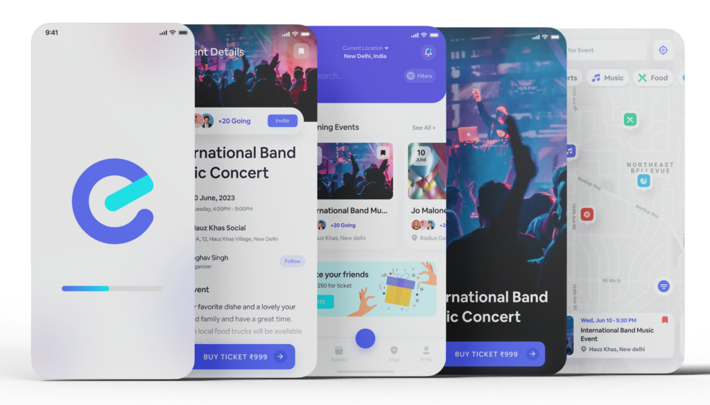
After the launch of Evently, we initiated an extensive testing and iteration phase to refine the app further. We closely monitored user feedback, analyzing their experiences and pain points. This valuable insight guided our iterative design process, allowing us to make necessary improvements. Through rapid prototyping, usability testing, and continuous iterations, we fine-tuned the app’s features, navigation, and overall user experience. This iterative approach ensured that Evently evolved into a more robust and user-friendly platform, meeting the needs and expectations of our target audience.
Design problem 1
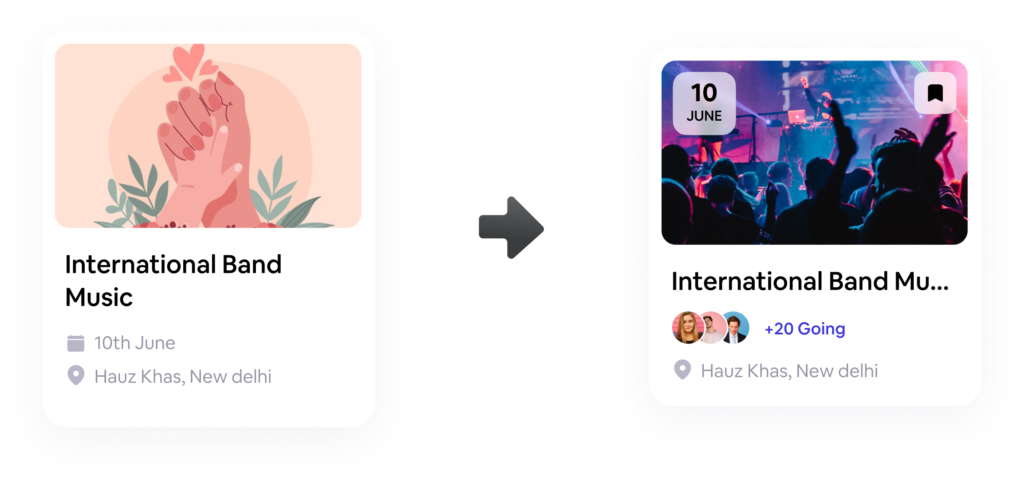
Evently lacks clear event details on the listing page, requiring users to navigate to separate pages, leading to a frustrating user experience and increased effort in finding essential event information.
Exploration
To address the issue of lacking clear event details on the listing page, we undertook a series of exploration steps. We then explored various design solutions, such as incorporating key event details (e.g., date, time, location, ticket price) directly on the listing page in a concise and visually appealing manner. Through wireframing and iterative prototyping, we tested different layouts and content hierarchies to determine the most effective way to present event information. These exploratory steps allowed us to identify an optimal design solution that provided users with the necessary event details at a glance, improving their overall browsing experience on Evently.
Final Results
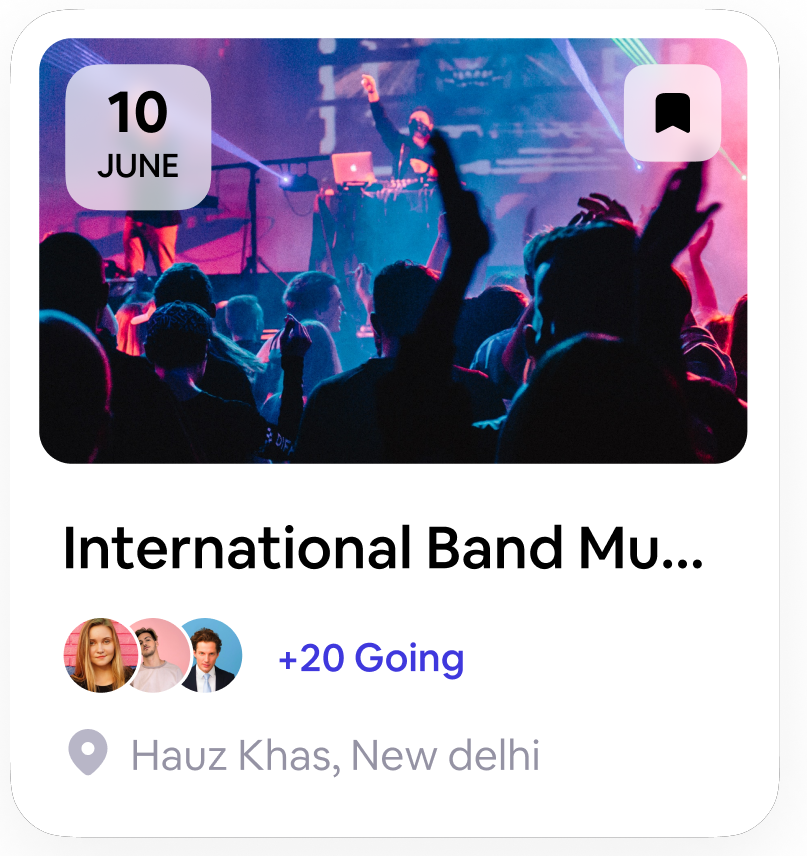
- Presented additional key event details directly on the listing page, eliminating the need for users to navigate to separate pages.
- Incorporated the number of attendees registered or interested in the event prominently on the listing page. This social proof can help build trust and generate interest among users, as they can see the level of engagement and popularity of the event.
- Utilized visually appealing graphics or icons to represent the attendee count, making it easily scannable and attention-grabbing.
- Add a prominent "Add to Wishlist" button on each event listing within the listing page. This button allows users to quickly save events they are interested in with a single click.
Design problem 2
Evently lacks an distance calculate feature for event locations, hindering users’ ability to make informed decisions and navigate to event venues effectively.
Ideate
To address the lack of a distance calculate feature for event locations, we explored potential solutions. One approach is to integrate a map functionality within Evently, allowing users to view event venues directly on the app. Pros of including the map feature include improved user decision-making, enhanced event planning, and ease of navigation. However, potential cons include increased development complexity, potential performance impacts, and additional user interface considerations. Balancing these factors, we evaluated the value and feasibility of incorporating the map feature to ensure a positive user experience on Evently.
Exploration
During the exploration phase, we researched and tested various approaches for implementing an in-app map feature in Evently. We evaluated different mapping APIs, considered user interface designs, and conducted usability tests to gauge user preferences and expectations.
Reaching to conclusion
After careful consideration, we concluded that including an in-app map feature would greatly benefit Evently’s users. It would provide them with a clear visualization of event locations, aiding in decision-making and enabling seamless navigation. While there are challenges to overcome, the overall value and positive impact on the user experience justify the inclusion of this feature.

- Integrated Evently with a reliable maps API of Google Maps, to calculate distances between the user's location and event venues. This feature will provide users with accurate and real-time information on the distance they need to travel.
- Incorporated an interactive map view within the detail pages. This map can display event locations and the user's current location, along with the distance information. Users can visually explore the map, identify nearby events, and easily gauge the distance between different venues.
- Integrated a directions and navigation feature within Evently. Users should be able to get step-by-step directions from their current location to the event venue.
- Provide users with the option to sort and filter event listings based on distance. This feature allows users to prioritize events that are closer to their location, making it easier for them to attend and plan their schedules accordingly.
Result
- The design improvements led to a significant increase in user engagement measured by higher app usage, longer session durations, and increased event bookings.
- The inclusion of the in-app map feature facilitated easy navigation and event discovery, enabling users to locate event venues with ease and make informed decisions about attending events.
- The inclusion of the in-app map feature facilitated easy navigation and event discovery, enabling users to locate event venues with ease and make informed decisions about attending events.
My learnings
- Prioritizing user needs and preferences throughout the design process is crucial for creating a successful and engaging product.
- Iterative design and continuous user feedback are key to refining and improving the user experience, resulting in a more polished and effective product.
- Effective collaboration and communication with cross-functional teams, stakeholders, and users are essential for aligning goals and delivering a cohesive and impactful design solution.
- Collecting and analyzing user data provides valuable insights that drive informed design decisions and optimize the product's performance.
