Trainity
An interactive learning platform

Overview
Trainity provides people a platform where they can learn and build work experiences like the people at the top tech companies do and get mentored by the top 1% of Industry Experts. Founded by aluminums of IIT Kharagpur. They are committed to to fill the gaping gap of unemployment and uncertainty with intensive and top-of-the-line programs, 500+ hiring partners, and a highly updated industry-vetted curriculum, designed to give an edge over competitors by working on Live Projects by top startups.
Problem Statement
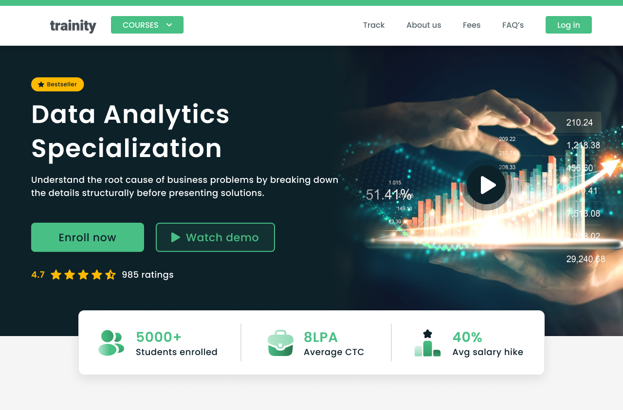
The current product details page lacks a comprehensive and engaging presentation of key features, benefits, and testimonials, leading to limited user understanding and conversion rates. Additionally, the absence of a dedicated section for micro certification courses hampers users’ access to valuable, bite-sized learning opportunities. The challenge is to redesign the product details page, optimizing content presentation, and introducing a new section for micro certification courses, enabling users to explore and enroll seamlessly within a concise and intuitive user experience.

My contribution
To enhance user understanding and engagement, I carefully curated the content presentation, ensuring that key features, benefits, and testimonials were prominently displayed. By employing a clean and intuitive layout, users could easily grasp the value proposition and make informed decisions.
Furthermore, I created a new section specifically dedicated to micro certification courses. This addition allowed users to access bite-sized learning opportunities that align with their interests and goals. The section provided comprehensive course descriptions, instructor information, and a seamless enrollment process, enabling users to easily explore and select courses that suited their needs.
Understanding the company
The company provides individuals with a unique online platform that aims to revolutionize the way people learn and gain practical work experiences, akin to those found at top-tier tech companies. By connecting users with a community of industry experts, the company strives to bridge the gap between theoretical knowledge and real-world application. At the heart of the company’s mission is the belief in the power of mentorship. By providing access to the top 1% of industry experts, the platform fosters a supportive and enriching environment where users can receive personalized guidance and invaluable advice from seasoned professionals.
Design problem 1
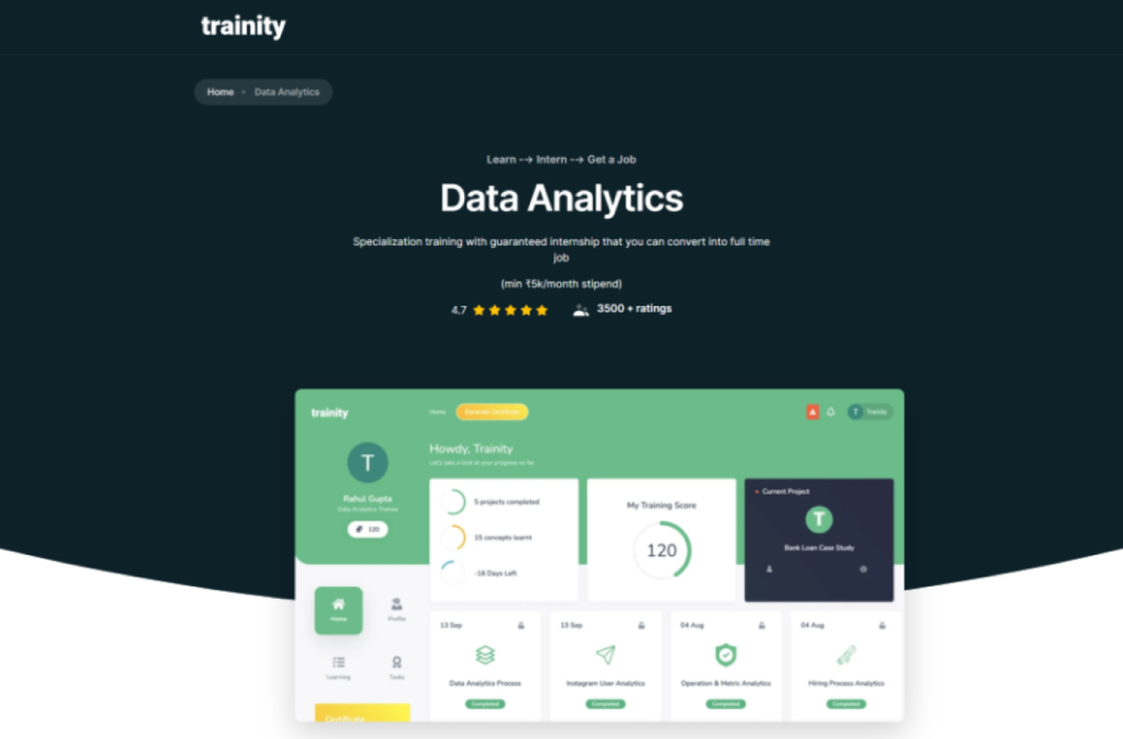
The current course detail page lacks a visually appealing and intuitive design, resulting in reduced user engagement and limited conversion rates. Users struggle to access vital information such as course descriptions, learning outcomes, and instructor details, leading to uncertainty and hesitation. The challenge is to redesign the course detail page, focusing on optimizing content presentation, improving visual appeal, and providing a seamless user experience.
Research
To address the challenges faced by the current course detail page, a comprehensive research approach was undertaken. Secondary research was conducted to gather industry trends, best practices, and user preferences in course presentation and information accessibility. Competitor research provided insights into how other platforms present course details and engage users effectively. This analysis identified opportunities for improvement and differentiation. Additionally, previous analysis data, including user feedback and behavior, was examined to identify pain points and areas of improvement specific to the existing course detail page.
By combining secondary research, competitor analysis, and previous analysis data, a solid foundation was established for informing the redesign of the course detail page, ensuring it meets user expectations and maximizes engagement.
Exploration
To address Problem Statement 1 and enhance the course detail page, an exploration of different UI screens was conducted and multiple design iterations were created. Throughout the exploration process, feedback was collected and analyzed to refine the UI screens further. Usability testing and iterative design methodologies were employed to validate design choices and make data-driven improvements.
Testing and Iterating
After multiple iterations and user feedback cycles, a conclusion was reached. The final UI screens successfully addressed the challenges identified in Problem Statement 1, providing an improved course detail page that offers a visually appealing and intuitive user experience. The conclusion was based on positive user feedback, increased user engagement, and improved conversion rates, demonstrating the effectiveness of the redesigned UI screens in meeting user needs and facilitating informed decision-making.


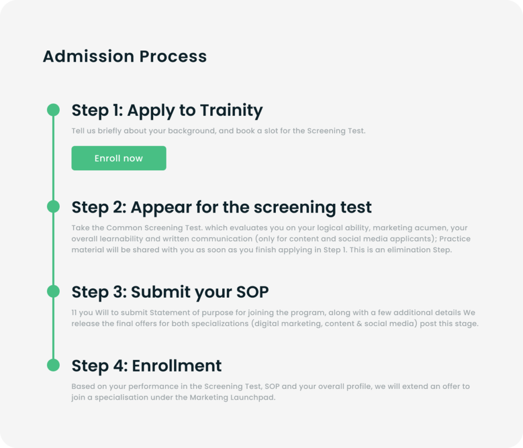
- Implemented a clear and intuitive information hierarchy to ensure vital details such as course descriptions, learning outcomes, and instructor details are prominently displayed.
- Simplify the enrollment process by reducing the number of steps required and making it intuitive and user-friendly.
- Incorporated high quality visuals because Visuals can help build trust by giving users a glimpse into what they can expect from the course and create a more engaging and immersive experience.
Design problem 2
The absence of a dedicated micro certification section on the home page creates a missed opportunity to showcase and promote the valuable bite-sized learning offerings. The challenge is to design and incorporate a prominently placed micro certification section that effectively communicates the benefits and encourages users to discover and engage with these focused learning opportunities.
Research
To address the absence of a micro certification section on the home page, thorough research was conducted. The competitor research aimed to identify how other learning platforms showcase and promote their micro certification offerings. The findings from the competitor research informed the design decisions for incorporating a dedicated micro certification section on the home page, ensuring it aligns with user preferences and effectively captures their attention.
Exploration
Different UI screens were explored to determine the optimal placement and visual presentation of the micro certification section. Various design elements such as banners, cards, or dedicated sections were considered to effectively highlight the value and benefits of micro certification courses.
Testing and Iterating
After multiple iterations and user feedback cycles, design decisions were made. The final UI screens showcased a prominently placed micro certification section on the home page, ensuring its visibility and accessibility to users. The design decisions were guided by a balance between visual appeal, information hierarchy, and ease of navigation, with the goal of capturing users’ attention and driving their interest in exploring and enrolling in micro certification courses.

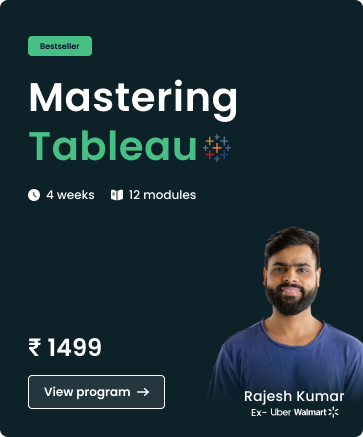
- Designed a prominently placed micro certification section on the home page, ensuring it is immediately visible to users without requiring scrolling.
- Incorporated a clear and compelling CTA that encourages users to discover and engage with the micro certifications.
- Craft a compelling headline that clearly communicates the benefits of micro certifications.
- Provided concise descriptions for each micro certification, highlighting the time duration and topics covered.
- Used action-oriented language such as "View Program" to encourage users to take the next step and engage with the certifications.
- Clearly labeled the micro certifications that have achieved the "Bestseller" status, giving users an immediate understanding of their popularity and value.
Result
- The average time spent on the course detail page increased by 27% , indicating that users were more interested in exploring course offerings and accessing detailed information.
- The combined impact of the redesign and the addition of the micro certification section resulted in a 18% increase in overall conversion rates. Users were more inclined to take action.
- The compelling changes in UI/UX attracted more visitors to the platform, resulting in a 15% increase in monthly traffic.
Summary
- The project began with thorough research, including secondary research, competitor analysis, and data analysis, to understand user needs, industry trends, and pain points. This laid the foundation for informed design decisions.
- Conducting competitor research provided valuable insights into industry trends and best practices. Analyzing competitor strategies helped identify opportunities for differentiation and informed design decisions.
- Multiple design iterations were explored, addressing specific problem statements. UI and UX enhancements were made to improve information hierarchy, visual appeal, navigation, and user engagement.
- The final designs were implemented, and the impact was evaluated. Key performance indicators (KPIs) such as course enrollment, user engagement, conversion rates, and monthly traffic were monitored to measure the effectiveness of the project.
